
Context
I was tasked with building a subsite off of Perimeter.org that hosts a 110-question assessment. The questions had to be easy to read on desktop, but especially on mobile, since most people would be taking the assessment on their phone.
Role
I designed and built the subsite end-to-end.
Constraints
Fill in: timeline, team size, scope.
Visuals
Design decision
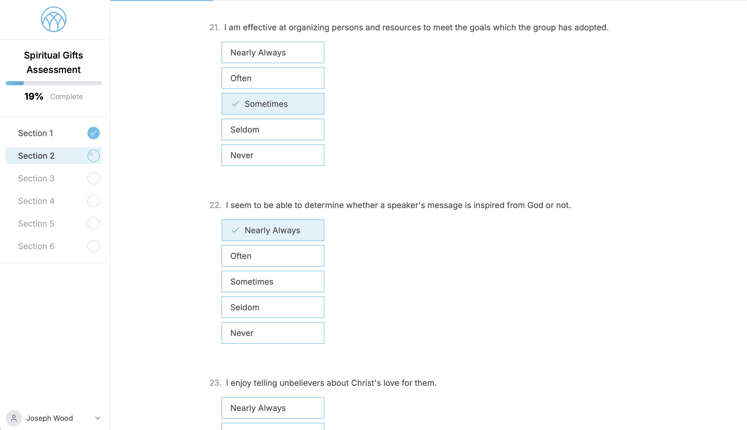
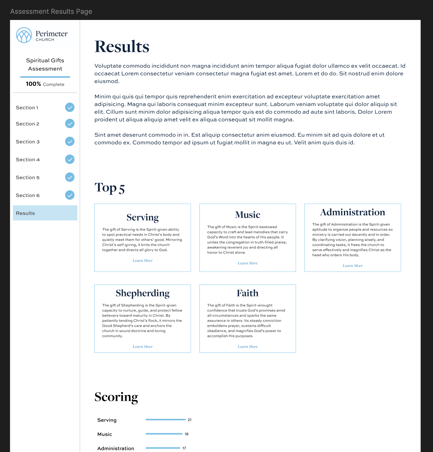
My goal was to make a long assessment feel manageable. Instead of putting 110 questions on a single page, I broke them up into smaller chunks so there is a clear sense of progression in small doses. That makes it much easier for someone to push through to the end. I also redesigned the results page into a much easier-to-read summary compared to the previous version of this assessment, so the payoff at the end matches the effort to get there.