
Context
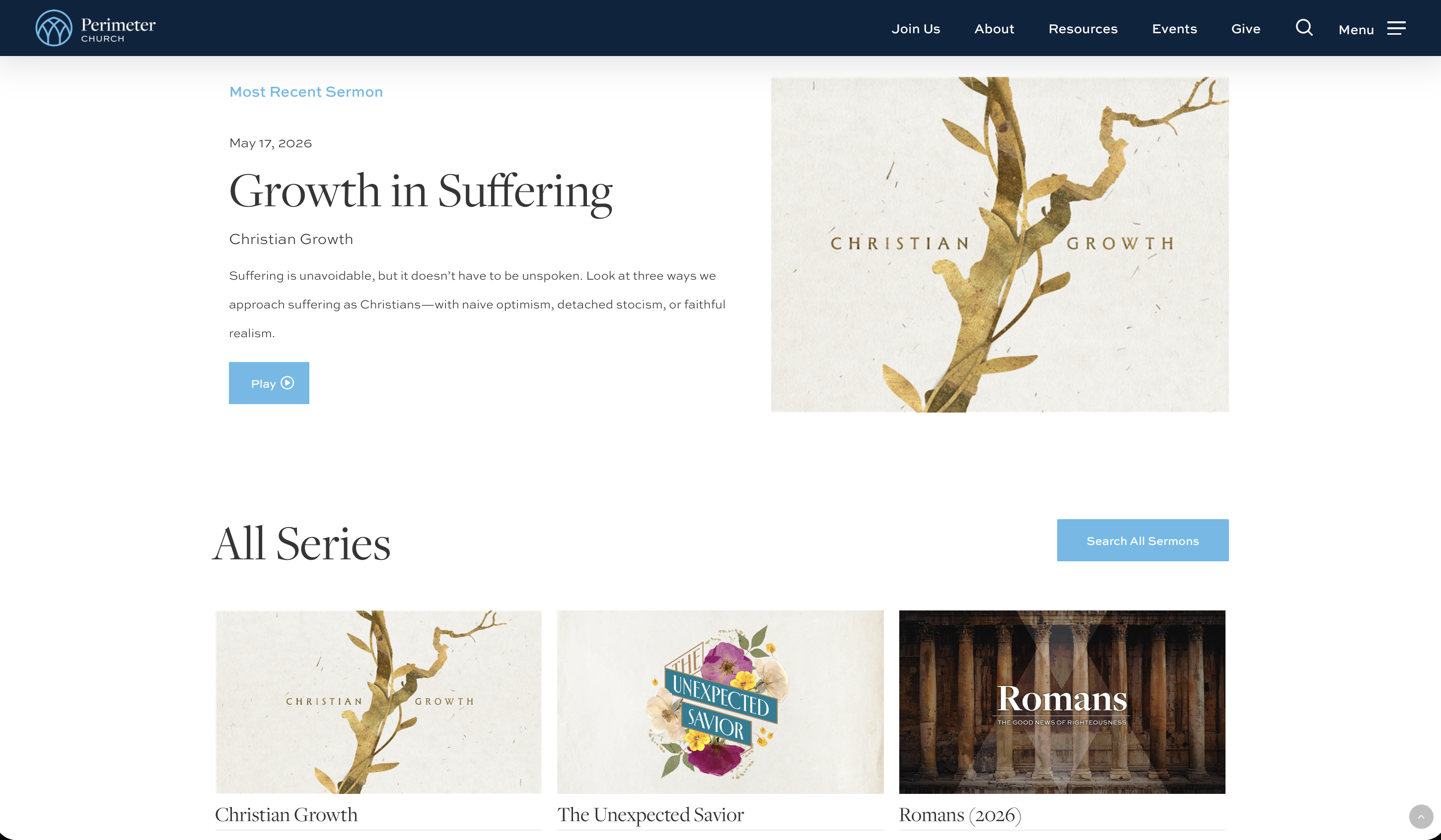
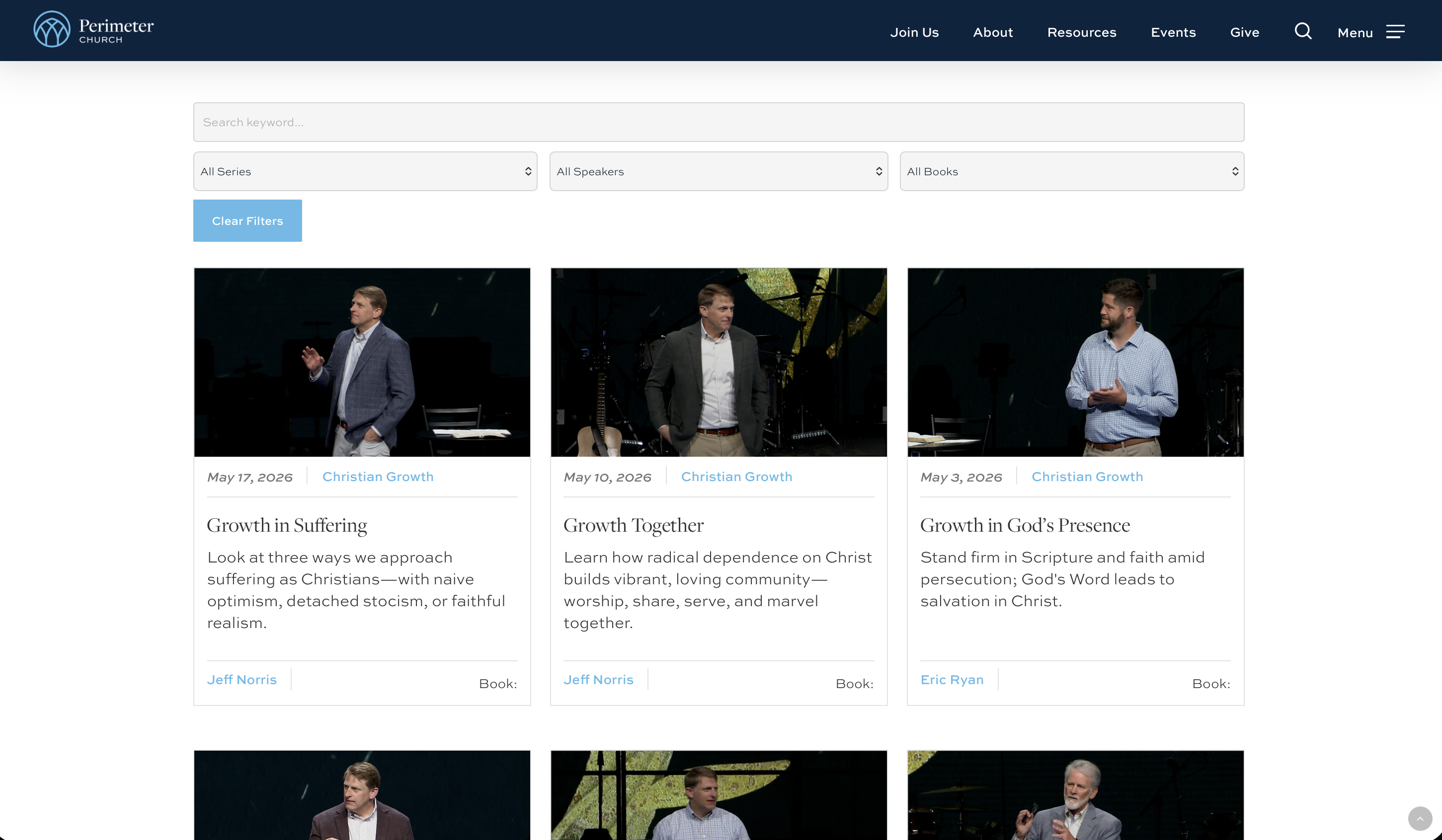
We had a lot of sermons to display and a lot of information to surface for each one. The previous setup was hard to scroll through and showed less data per sermon, which made it tough for people to find what they were looking for.
Role
I designed the sermon widget — the card layout, the filtering and search, and the mobile behavior.
Constraints
Fill in: timeline, team size, scope.
Visuals
Design decision
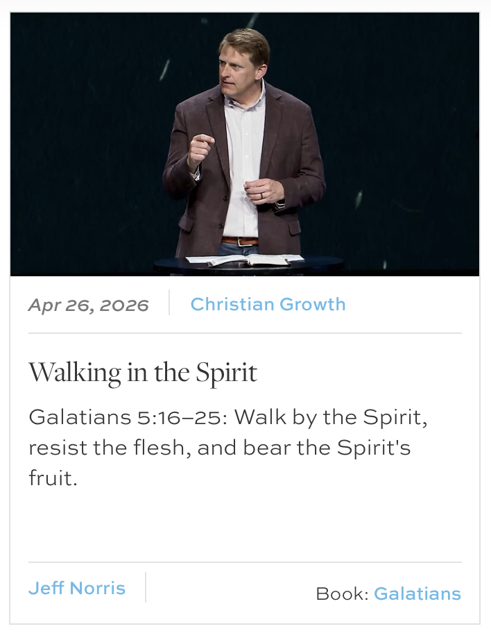
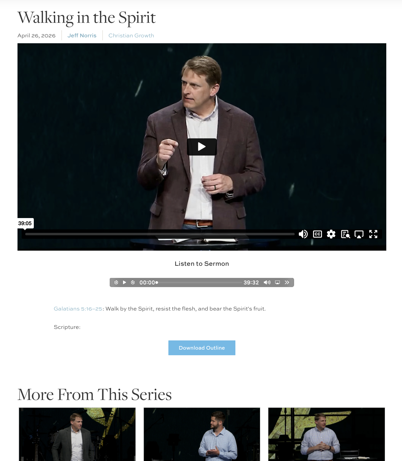
I made each sermon a card that displays the crucial information up front so it is easy to scan. Many of the elements on the card are themselves links — tapping a speaker, series, or topic filters the list and surfaces more sermons like it. There is also a search bar and filters at the top of the widget. All of it is just as easy to use on mobile as on desktop. The result is that people can move through a lot of sermons in an easy-to-read format, which the old setup did not allow.